Css Background-Image 的应用
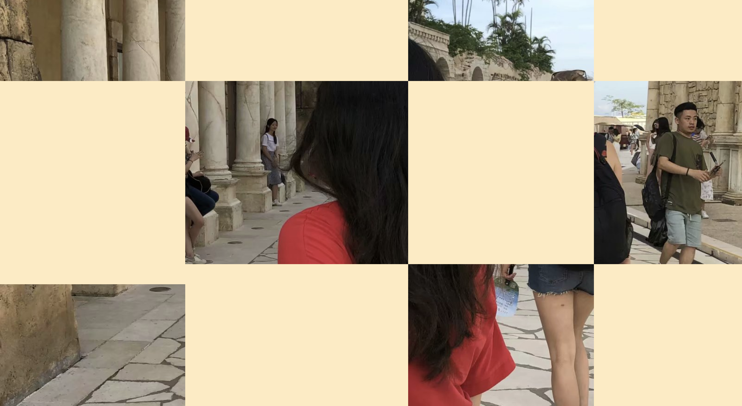
一、多背景叠加
/* 多背景图 */ |

二、三角形背景
<!-- 三角形背景 --> |
body { |

三、背景图叠加渐变
.gradient { |

四、背景颜色切换动画
/* clolor animate */ |

五、网格背景
<div class="container"> |
/* 网格背景图 */ |
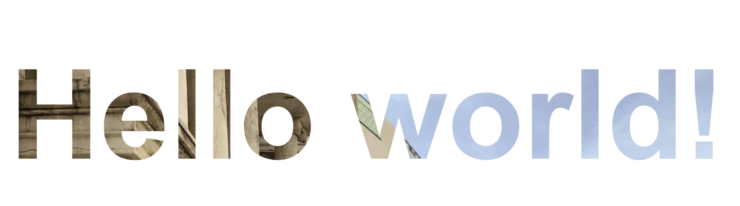
六、图像设置为文本颜色
<body class="center> |
/* 把图像设置为文本颜色 */ |
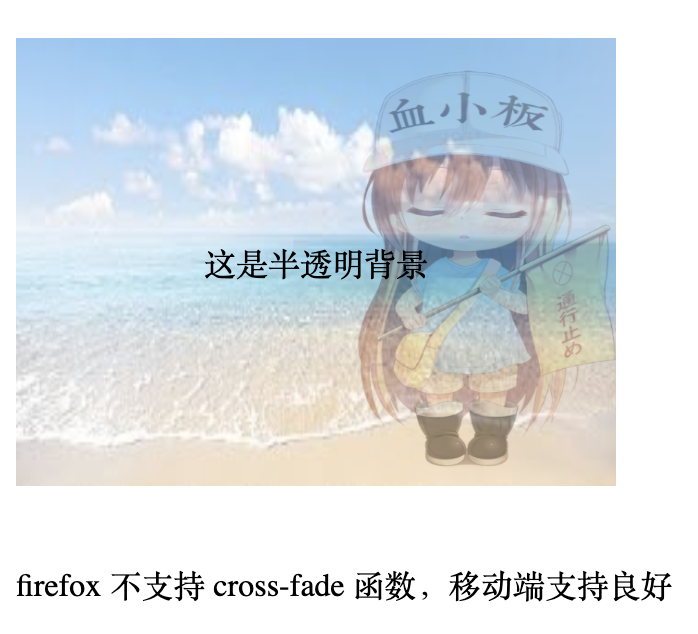
七、背景图半透明叠加
使用 cross-fade 函数通过背景融合的方式实现背景图的效果,目前只支持 (url1, url2, percent) 的方式,(url percent, url percent) 这种方式试了下,没效果。
.cross-fade-image { |
本文标题:Css Background-Image 的应用
文章作者:Canace
发布时间:2020-07-08
最后更新:2024-04-23
原始链接:https://canace.site/css-background-image%E7%9A%84%E5%BA%94%E7%94%A8/
版权声明:转载请注明出处
分享