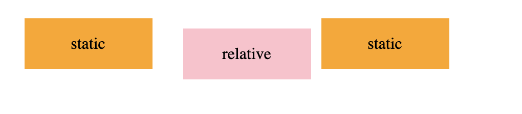
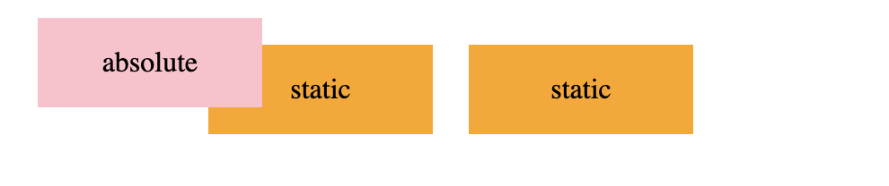
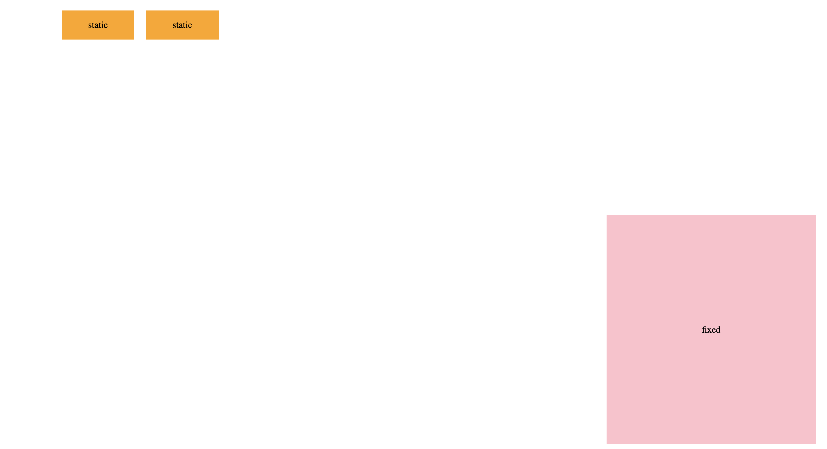
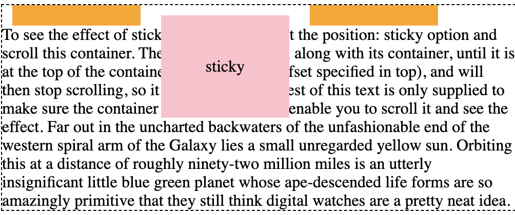
CSS position 总共分为以下几种类型:static、relative、absolute、fixed、sticky。

一、static

static 是 position 的默认值,元素处于正常文档流,在该值下,元素设置 top、left 等位置信息和 z-index 无效。

static

demo

<!-- static 定位 -->
<div class="wrap">
<div class="static-item">static</div>
</div>
.wrap {
position: relative;
display: flex;
justify-content: center;
align-items: center;
width: 500px;
height: 100px;
}
.static-item {
position: static;
display: flex;
justify-content: center;
align-items: center;
width: 25%;
height: 50%;
background: orange;
margin: 0 10px;
}

二、relative

relative 定位,元素处于正常文档流,父元素会对该元素留有一定的空间,left、top 等位置设置,相对于当前元素偏移。该设置对 table 类的属性不支持。

relative

demo

<!-- relative 定位 -->
<div class="wrap">
<div class="static-item">static</div>
<div class="relative-item static-item">relative</div>
<div class="static-item">static</div>
</div>
.relative-item {
position: relative;
left: 10px;
top: 10px;
background: pink;
}

三、absolute

absolute 定位,元素被移除正常文档流,父元素不会对该元素留空间。left、top 等位置设置,相对于非 static 定位的祖先元素偏移。

absolute

demo

<!-- absolute 定位 -->
<div class="wrap">
<div class="static-item">static</div>
<div class="absolute-item static-item">absolute</div>
<div class="static-item">static</div>
</div>
.absolute-item {
position: absolute;
left: 10px;
top: 10px;
background: pink;
}

四、fixed

fixed 定位,元素脱离正常文档流,父元素不会对该元素留空间。left、top 等位置设置,相对于视口偏移。

fixed

demo

<!-- fixed 定位 -->
<div class="wrap">
<div class="static-item">static</div>
<div class="fixed-item static-item">fixed</div>
<div class="static-item">static</div>
</div>
.fixed-item {
position: fixed;
right: 10px;
bottom: 10px;
background: pink;
}

五、sticky

sticky 定位,元素处于正常文档流,left、top 等位置设置,相对于最近滚动祖先偏移。

sticky

demo

<div class="sticky-wrap">
<div style="float: left; margin-top: 10px;" class="static-item">static</div>
<div style="float: left; margin-top: 10px;" class="sticky-item static-item">sticky</div>
<div style="float: left; margin-top: 10px;" class="static-item">static</div>
<div style="clear: left;">To see the effect of sticky positioning, select the position: sticky option and scroll this container.

The element will scroll along with its container, until it is at the top of the container (or reaches the offset specified in top), and will then stop scrolling, so it stays visible.

The rest of this text is only supplied to make sure the container overflows, so as to enable you to scroll it and see the effect.

Far out in the uncharted backwaters of the unfashionable end of the western spiral arm of the Galaxy lies a small unregarded yellow sun. Orbiting this at a distance of roughly ninety-two million miles is an utterly insignificant little blue green planet whose ape-descended life forms are so amazingly primitive that they still think digital watches are a pretty neat idea.</div>
</div>
.sticky-item {
position: sticky;
top: 10px;
background: pink;
}